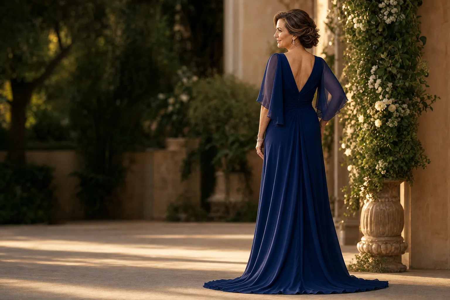
Choosing a mother of the groom dress color is less about following one rigid rule and more about finding a color that belongs in the wedding while still feeling true to you. The right answer usually comes from four things: the couple's preferences, the event formality, the setting, and the colors that make you feel your best.
That sounds simple, but it helps to decide in the right order. Start with the wedding's overall direction, then narrow toward colors that flatter you and fabrics that make sense for the season. This keeps the decision from turning into a search for one approved shade and gives you a more useful standard: a look that feels polished in the photographs and comfortable throughout the day.
Start with the wedding's visual direction
Ask the couple for a broad sense of the palette, venue, dress code, and time of day. You do not need an exact swatch or a copy of every bridesmaid dress. A few anchors are enough. A formal evening wedding might welcome navy, black, deep emerald, aubergine, or rich jewel tones. A garden or daytime celebration may lean softer, with dusty blue, sage, muted rose, lavender, or warm taupe. A destination wedding can open the door to lighter tones, print, and more fluid fabric.
Think of your color as part of the scene, not part of the bridal party uniform. A mother of the groom dress should complement the setting and the people closest to the couple without disappearing into the background. If the wedding party is in pale blue, for example, a darker marine blue, slate, or soft silver can feel connected without looking copied.
Coordinate with the mother of the bride, not against her
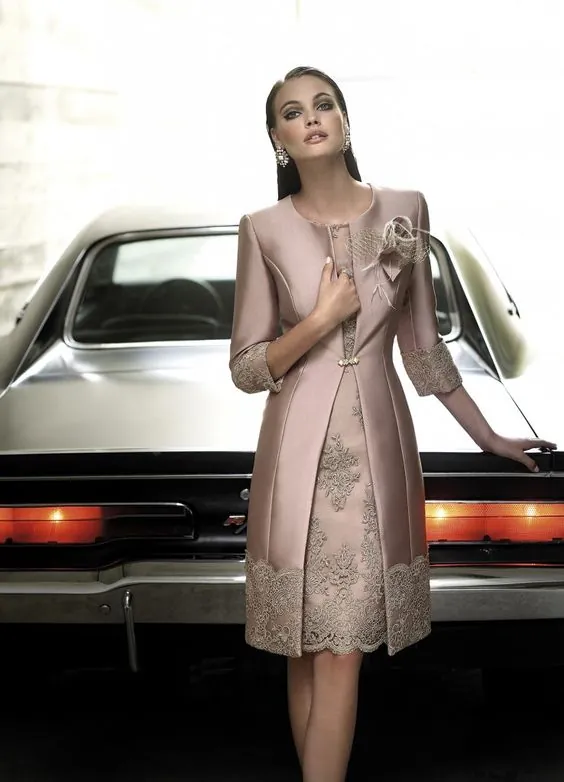
Traditionally, the mother of the bride chooses a general direction first, then shares it with the mother of the groom. The goal is not a matched pair. It is a conversation that avoids accidental duplication and makes sure the two looks sit comfortably beside one another in family photographs.
Share a quick photo, fabric swatch, or simple color description once you have a few options. Consider color temperature as well as the named shade. A cool-toned steel blue and a warm champagne can work beautifully together. Two very similar pale blush gowns can look less intentional, especially when the bridesmaids are also in blush. When in doubt, choose complementary depth rather than the same hue: one woman in navy and the other in soft blue, or one in deep plum and the other in a muted mauve.
Use formality and time of day to narrow the color
Color changes character depending on light. A pale metallic can look luminous at an afternoon ceremony, while the same shade may look washed out under evening reception lighting. Deep navy, wine, forest green, and black tend to hold their shape after sunset. Mid-tone colors such as teal, sapphire, magenta, and plum can carry a celebratory presence in almost any light. Soft colors often work best when the fabric adds dimension through texture, beading, or a subtle sheen.
For black-tie weddings, the fabric is just as important as the color. Satin, crepe, silk-like finishes, lace, and finely beaded details can make a dark shade feel special-occasion ready. For a relaxed outdoor wedding, a lighter matte fabric or a floral detail may feel more natural than high-shine embellishment. A great color in the wrong fabric can still feel out of place.
Choose a color that supports your own complexion and confidence
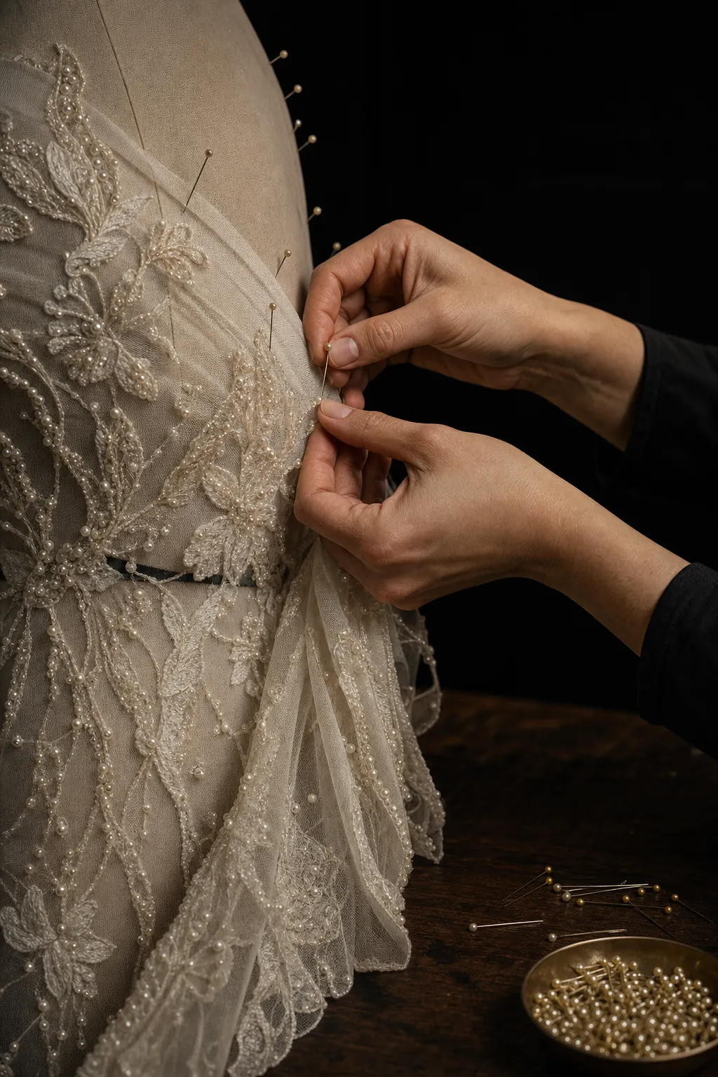
Wedding photos last, but so does the experience of wearing the gown. Once you understand the event direction, bring the decision back to the colors that make you feel alert, elegant, and comfortable. If you consistently receive compliments in cobalt, teal, or blue-red, those are useful clues. If beige or pale gray tends to drain your complexion, a richer neutral such as mushroom, bronze, pewter, or warm taupe may be a better choice.
Try on fabrics close to your face in natural light. This reveals more than a dressing-room mirror. Notice whether the color brightens your skin, whether the makeup you plan to wear feels easy, and whether the color holds up at a distance. A strong color does not have to be loud. A clean sapphire or deep green can look more refined than a pale color that makes you feel uncertain.
Think in color families, not one exact swatch
Trying to find one exact shade can make the process far more difficult than it needs to be. Wedding colors appear differently across satin, crepe, lace, chiffon, and beading. They also change under daylight, candles, and reception lighting. Instead of treating the palette like a paint card, choose a color family with enough range to work with the fabric and silhouette you love.
For a blue wedding palette, that might mean slate, navy, smoky blue, peacock, or soft steel. For a warm neutral palette, it could mean champagne, bronze, mocha, caramel, or deep taupe. The color family keeps your look connected to the wedding while giving you room to choose a shade that photographs well and makes you feel like yourself.
Plan the whole look before you make the final call
Color is easier to judge when you can see it with the shoes, jewelry, wrap, and hairstyle you are likely to wear. A simple navy crepe gown may feel formal and clean with gold jewelry, or more romantic with pearl accessories and a soft metallic shoe. A pale silver gown may need a richer lip color or more contrast in the earrings to keep the finished look from feeling too quiet in photographs.
Pick the color and silhouette first, then make sure the details reinforce the mood. A wedding day is long, and a look that feels cohesive will always carry more confidence than one assembled from several unrelated almost-right choices.
When a custom color or fit makes the decision easier
Sometimes the right color exists, but not in the silhouette you want. Other times the gown has the right neckline but needs sleeves, a different coverage level, or a more comfortable fit. That is where a made-to-order approach can be especially helpful. Rather than settling for a near match, you can start with a silhouette you like and refine the color, sleeve, neckline, or finish around the wedding.
Darius Cordell Fashions creates formal looks for the women standing beside the couple, including mother-of-the-wedding gowns with room for personal changes. The custom design process can begin with an inspiration image, a preferred color family, or a detail you want to make your own. For timing, the site's custom order guidance recommends planning well ahead of the event, especially for made-to-order work.
Frequently asked questions
Mother of the groom dress color questions
Does the mother of the groom have to match the mother of the bride?
No. The two looks should feel compatible in formality and overall mood, but they do not need to match in color, fabric, or silhouette. A quick conversation helps both women choose colors that look intentional together.
Can the mother of the groom wear black?
Yes, when it suits the wedding formality and the couple is comfortable with it. Black can look especially polished for an evening, city, or black-tie celebration. The accessories, fabric, and silhouette can keep it feeling celebratory rather than severe.
When should the mother of the groom choose her dress color?
Start after the couple has settled the wedding palette and the mother of the bride has a general direction. You do not need to wait for every flower or linen decision, but choosing early gives you more freedom to find the right fabric, fit, and alterations.
What colors should the mother of the groom avoid?
Avoid white, ivory, and anything that could be mistaken for bridal unless the couple specifically requests it. It is also wise to avoid a shade that deliberately duplicates the wedding party unless that coordination has been agreed on.
A more personal fit
Have a color in mind?
Share the wedding details and the gown direction you are considering. The Darius Cordell team can help you explore the next step.
Request a Quote


