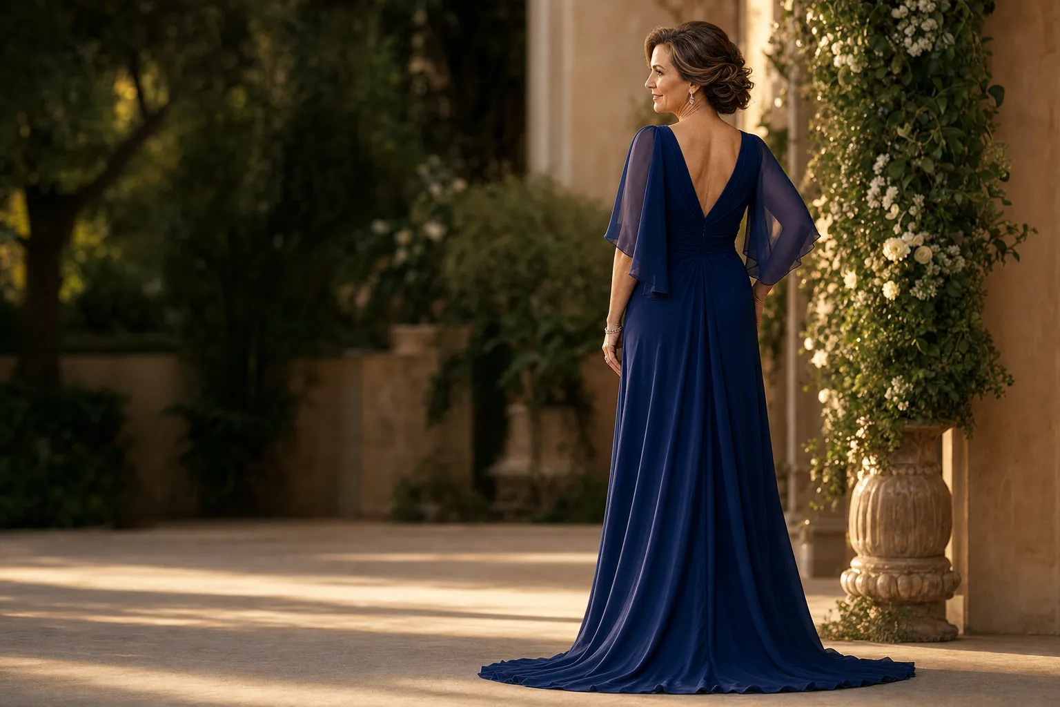
The best color for a pageant dress is not a universal shade. It is the color that makes your face, posture, and gown read clearly when you are moving under the lights. A beautiful color can lose its effect when it blends into the stage, flattens in a photograph, or feels unlike you the moment you begin to walk. The right choice gives the entire look more presence without asking you to be louder than you are.
That is why color is worth choosing with more care than a quick mirror test. Your competition, stage, complexion, silhouette, fabric, and finishing details all change the answer. Start with the character you want the gown to have, then test the finalists in motion. This guide gives you a practical way to narrow the choice without turning it into a search for one magic swatch.
Start with the competition and the setting
Before choosing a color, make sure you understand what the evening-wear portion of your own competition expects. Some systems lean classic and polished. Others allow a stronger fashion point of view, more obvious embellishment, or a bolder color statement. The event’s official guidance and recent stage photographs are useful for understanding the range of formality, but they should not turn into a reason to copy someone else’s look.
Then consider the stage itself. A large theater, a ballroom runway, and a smaller local venue give color different jobs to do. A deep tone may feel powerful against a bright stage. A vivid color can create a clear first impression in a neutral room. A subtle metallic may look luminous when the light is soft, or distracting when it catches every spotlight. Think about the backdrop, floor color, and lighting as part of the gown’s environment.
If you do not have access to the venue in advance, ask for photos from a recent event or a clear description of the setting. You are not trying to predict every lighting cue. You are looking for a color with enough depth and contrast to stay visible when the setting changes.

Choose the impression before the shade
Color works best when it supports a clear point of view. Before naming a shade, write down three words for how you want to be read on stage. You might choose polished, regal, and composed. You might prefer warm, luminous, and memorable. The words do not need to sound dramatic. They simply give you a standard for every option you compare.
Deep jewel tones such as sapphire, emerald, wine, and rich plum often feel intentional because they hold their depth from a distance. Clear brights can feel energetic and fresh when the competition and your personal style support that kind of statement. Black, navy, and deep charcoal can look exceptionally elegant when the fabric, shape, or detail keeps the gown visually alive. Soft tones and metallics can be beautiful too, but they benefit from a little more attention to contrast, texture, and lighting.
Do not choose a color only because it is associated with a winner, a trend, or a pageant tradition. A contestant who feels most at ease in saturated color may look more convincing in sapphire than in a pale metallic. Someone with a quieter, architectural style may carry black or midnight blue with much more presence than a bright shade. The strongest look is the one that gives you more ease, not a costume version of confidence.
Use your complexion as information, not a rulebook
Your complexion, hair color, and makeup direction can help you narrow the field, but they do not assign you one approved color family. Start with real evidence from your own closet and photos. Which colors make your skin look awake? Which shades tend to disappear next to your hair or leave you reaching for more makeup than usual? Compliments are useful clues when they are consistent over time.
Test fabric near your face in natural light first. Notice whether the color brings definition to your features or makes your face look muted. Then take a few phone photos from several feet away. A color can look lovely up close and still be too close to your skin tone or hair color from the audience’s point of view. The goal is not harsh contrast. It is enough separation that your expression remains the first thing people notice.
When you are comparing a warm and cool option, keep the rest of the look simple. Try similar silhouettes, use similar lighting, and avoid changing every accessory at once. A blue-red, berry, emerald, deep teal, midnight blue, bronze, or champagne may all be worth testing depending on the effect you want. The camera and your own comfort will tell you more than a color label ever can.

Let fabric and detail change the color decision
A color never appears by itself. Satin reflects light differently from matte crepe. Beading can make a dark color sparkle, while textured lace can add depth to a softer shade. A simple navy gown may read as formal and controlled in crepe, then become much more dramatic in a high-shine fabric with crystal detail. The named color is only the starting point.
When a color feels a little quiet, look for depth before abandoning it. A richer fabric texture, a thoughtful beaded pattern, or a clean contrast at the neckline may be all it needs. When a color feels too strong, a more matte finish or a simpler silhouette can bring it back into balance. One clear idea tends to travel farther across a stage than several competing details.
Black is a useful example. It can look severe or it can look strikingly elegant. A black gown with a beautiful line, controlled shine, or precise beading has enough visual variation to remain visible. The same principle applies to white, pale silver, blush, and nude tones. They can be stunning, but only if the setting, fabric, and details create enough separation from the background and from your own complexion.
Test the finalists in motion and at a distance
Once you have two or three strong options, stop judging them only in the mirror. Put on the shoes you expect to wear and record a short entrance, a turn in both directions, a pause, and an exit. Film in daylight and under the brightest overhead lighting available. You do not need professional equipment. A phone video from several feet away is often more useful than another close-up selfie.
Watch the video without sound. Where does your eye go first? Can you still see your face clearly? Does the color keep the gown’s shape visible, or does it become one flat block under the light? Does the sheen catch beautifully, or does it create distracting bright spots? A gown that seems less exciting on a hanger may become the obvious choice once it moves.
Ask one or two people whose judgment you trust to describe the impression before you tell them your favorite. Their first response may reveal whether the color reads as polished, vibrant, soft, dramatic, or something else entirely. Still, your own response matters most. You need to be able to walk, pose, and wait backstage without second-guessing the choice.
Use the same test for every finalist. Compare the gowns from the same distance, in the same shoes, with a similar hair and makeup direction. Changing the lighting, the camera angle, and the accessories at the same time makes it harder to see what the color is actually doing. A simple side-by-side video gives you a clearer decision than dozens of disconnected fitting-room photos.
Give yourself a little time between the first try-on and the final decision. The color that creates the biggest immediate reaction is not always the one that feels strongest after a full walk, a turn, and a few minutes under bright light. A pageant gown has to hold its presence through the whole moment, not only in the first mirror glance.

Coordinate color with the complete look
Dress color does not need to match every accessory, but the full look should feel connected. Choose the gown first, then let shoes, jewelry, hair, and makeup reinforce its mood. A deep jewel-tone gown may call for jewelry that frames the face without competing. A light metallic may need a stronger lip color or a more defined earring to keep the overall look from becoming too quiet at a distance.
Bring the accessories you are considering to a fitting when possible. The wrong shoe color can break a long line when it shows during a step. A bold necklace can compete with an ornate neckline. A hairstyle that works beautifully with a clean column gown may hide the shoulders of a more detailed design. Seeing the whole look together gives you a better answer than deciding each piece in isolation.
For more help with the bigger decision, the pageant dress silhouette guide explains how the main shapes change your movement and stage presence. The pageant evening gown guide is useful when you are also deciding on a train, cape, overskirt, or finishing details.
When a custom color makes sense
Sometimes you find a color you love, but it is only available in the wrong silhouette. Other times the gown has the right line but needs a different shade, more coverage, a calmer finish, or a stronger detail near the face. That is when a custom conversation can be especially helpful. Instead of settling for a near match, you can start with the feeling you want and refine the color, fabric, and finishing details around it.
Darius Cordell Fashions creates custom pageant dresses for contestants who need the look to feel personal from every angle. Browse the pageant gown collection for a sense of the available directions, then use the custom design process to begin with an inspiration image, a color family, or one detail you want to make your own. When timing matters, the planning guide explains how to work backward from your competition date.
A simple pageant dress color checklist
- Confirm the setting. Review the competition expectations, stage, and level of formality before choosing a direction.
- Name the impression. Use three words to decide whether the gown should feel polished, dramatic, luminous, modern, or something else that feels true to you.
- Compare color with silhouette. Test your finalist shades in the same gown shape whenever possible.
- Check the fabric. Look at the color in the actual satin, crepe, lace, beading, or texture you expect to wear.
- Film the movement. Watch a short walk and turn from a distance in daylight and bright overhead light.
- Finish the whole look. Bring in your shoes, jewelry, makeup direction, and hairstyle before making the final call.
Frequently asked questions
Pageant dress color questions
What color pageant dress looks best on stage?
The strongest color is the one that gives your face and overall line clear contrast under the actual stage lighting. A rich jewel tone, a deep neutral, a clear bright, or a thoughtful metallic can all work when the color supports your complexion, the competition, and the gown’s silhouette.
Can I wear black for a pageant?
Yes, when it suits the competition and the look has enough dimension to read under the lights. Beading, texture, sheen, a strong neckline, or a clean silhouette can keep black from looking flat. Review your competition’s expectations before making the final call.
Should I choose my pageant dress color before the silhouette?
Usually, choose the silhouette first or narrow both decisions together. The shape determines how the gown moves and where the eye travels, while color finishes that story. Once the line feels right, compare a few colors in the same silhouette and lighting.
How can I tell whether a color photographs well?
Film a short walk and turn from several feet away in the shoes and makeup direction you expect to wear. Check the color in daylight and under bright overhead light. The best choice is one that still gives your face clear presence and keeps the gown’s shape visible when you are moving.
A more personal direction
Ready to find the color that feels like you?
Share your competition date, color ideas, and the details that matter most in your finished look.
Request a Quote